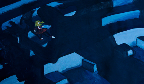
I’ve been on a bit of a comic book kick lately when painting stuff outside of class. I love the really graphic bold lines of comic book art and thought it would be good practice for me to play with a totally different style of painting than what I normally do. I did this reproduction of a painting from one of my all time favorite TV shows, Heroes, a few weeks ago. You can see the original “painting” from the show here.
Unfortunately, this was before I’d learned all about medium and gel. It would be sooooo much easier to do now that I’ve picked up some glossy gel! A few coats of glaze mixed with black? Much easier than watering down my acrylics so much so that the paper is rippled and warped even though it’s taped down to a board! If I learn nothing else during the rest of my class, it will have been well worth the cost just for discovering medium. Love it!
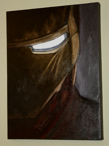
Next up on my hero exploration was a birthday gift for one of my longtime friends, Hoops. He’s a big comic book fan and with all the summer fandemonium over the new Ironman movie, I decided trying to paint the poster from the movie would be perfect for him.

Initially I thought the poster would be good since it’s got such simple lines and doesn’t look too cartoony; I can see it hanging on a wall without looking like a kid’s bedroom. What I didn’t take into account is how hard it is to paint in that style. I used so many layers of glaze trying to get a good metal effect, trying to get the whitish blue glow from the eyes. I kept going back over it, waiting for it to dry, doing a few more layers, then going back and redoing the details AGAIN. I have no idea how long it took me to finally finish since I spread it out over 3 or 4 sessions. Phew!
I bought some new paint for this project too – Stevenson’s gold. That was definitely a big help and lots of fun to play with. All in all I think the painting turned out well and the birthday boy was happy, so it was worth the many hours it took to finish.
I uploaded a shot of the finished painting to my Flickr, but it’s not a great respresentation since the room was so dark and I needed to use flash. I really need to get some better lighting in here. In real life the painting is much darker overall and the gold looks like real gold. The wall it’s hanging on IS green though, so the rest of the colors aren’t shifted too much.